出错的原因在于,我根本就没给GSEA分析的结果写barplot方法,所以默认去调用graphics::barplot.default了,于是出错。
但这样的图,对于我们来说,简直简单的不要不要的。
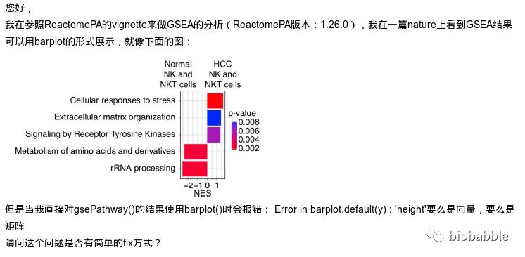
首先跑一下GSEA的分析, 这里用ReactomePA来跑一下通路的GSEA分析:

出错的原因在于,我根本就没给GSEA分析的结果写barplot方法,所以默认去调用graphics::barplot.default了,于是出错。
但这样的图,对于我们来说,简直简单的不要不要的。
首先跑一下GSEA的分析, 这里用ReactomePA来跑一下通路的GSEA分析:
今天讲一个小技巧,首先数据还是得有,很简单地生成一些随机数:
set.seed(2019-10-23)
d <- data.frame(val=abs(rnorm(20)),
                type=rep(c('A', 'B'), 10))
20个数长这样子:
          val type
1  0.04625141    A
2  0.28000082    B
3  0.25317063    A
4  0.96411077    B
5  0.49222664    A
6  0.69874551    B
7  0.82134409    A
8  0.70966741    B
9  1.56752284    A
10 1.12881681    B
11 0.82488089    A
12 0.19897743    B
13 0.76739568    A
14 0.70597703    B
15 0.24332380    A
16 0.55423292    B
17 2.49008811    A
18 1.35153628    B
19 2.13711738    A
20 0.92299795    B
MacOS用户如果有用命令行的话,大多数人应该知道open .会打开Finder。事实上它能打开所有的目录,比如:
$ open ~/Library/Preferences
$ open /etc
$ open ../..
你还能同时打开多个目录:
$ open ~/Documents ~/Desktop ~/Downloads
$ open ~/D*
然后它还能打开各种文件,比如:
$ open document.pdf
upsetplot大家见得多,首先来个富集分析的实例:
library(DOSE)
data(geneList)
de <- names(geneList)[abs(geneList) > 2]
edo <- enrichDGN(de)

library(enrichplot)
upsetplot(edo)
《基佬的屁股和科学家的屎,之间的共同点是…!》这篇推文发表之后,发现大家对屎尿屁还是蛮有兴趣的,画屎除了展示的emojifont包之外,也提到了ggimage包,其实用ggimage包更有趣!这里也演示一下,一起来玩屎,看看自己到底是搅屎棍还是化粪池!玩屎玩出花来。
先来一张线性拟合的图:
set.seed(123)
iris2 <- iris[sample(1:nrow(iris), 30), ]
model <- lm(Petal.Length ~ Sepal.Length, data = iris2)
iris2$fitted <- predict(model)

iris3 <- iris2[abs(iris2$Petal.Length-iris2$fitted) > 0.5,]
p <- ggplot(iris2, aes(x = Sepal.Length, y = Petal.Length)) +
    geom_point() +
    geom_linerange(aes(ymin = fitted, ymax = Petal.Length),
                   data=iris3, colour = "purple") +
    geom_abline(intercept = model$coefficients[1],
                slope = model$coefficients[2])
p

I have been using clusterProfiler, which is a very useful package for gene set analysis and visualisation. I would like to use the ‘cnetplot’ function to plot a network of GO terms and the related genes. However for larger networks, the automatic display can be confusing and it would be helpful to be able to move nodes around. In the past I could do this with with cnetplot(fixed=FALSE) option, but after updating R and re-installing clusterProfiler, the output remains static.
I am using R 3.5.3 with clusterProfiler v3.10.1 which I installed using Bioconductor 3.8. I have installed and loaded the ‘igraph’ package, and the following test code produces output in an interactive window, as desired:
library(igraph) g <- make_ring(10) tkplot(g)
Is there any way to make cnetplot output interactive, or is that functionality simply not available in the latest release?
Any help would be greatly appreciated!

在《ggplotify - version 0.0.4》一文中,有粉丝说想要支持Gviz包,画图包如果输出的是对象,那么我们可以写方法针对这个对象,然而Gviz的输出,却是list,显然这个方法走不通。
