
dotplot for enrichment result
This is a feature request from clusterProfiler user. It’s similar to what I implemented in clusterProfiler for comparing biological themes. For comparing different enrichment results, the x-axis represent different gene clusters while for a single enrichment result, the x-axis can be gene count or gene ratio. This is actually similar to traditional barplot, with dot position as bar height and dot color as bar color. But dotplot can represent one more feature nicely by dot size and it can be a good alternative to barplot.
library(DOSE)
deg = names(geneList)[abs(geneList) > 1]
do = enrichDO(deg)
dotplot(do, showCategory=20)
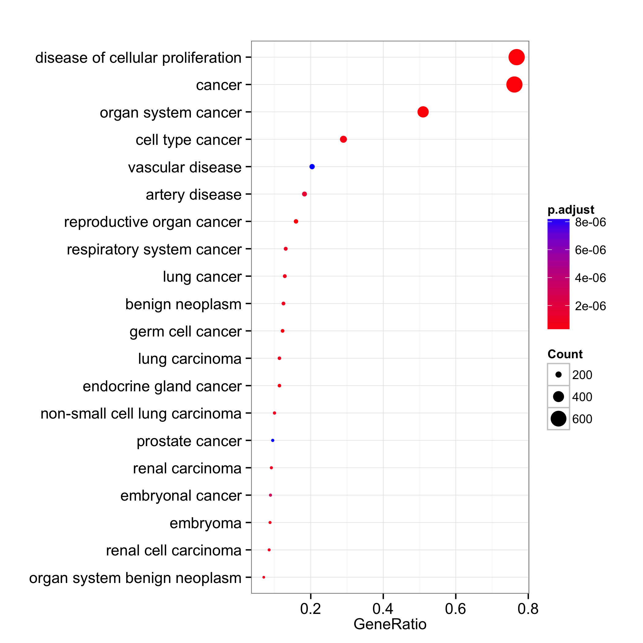
We can set the x-axis to use gene count and dot color by one of ‘pvalue’, ‘p.adjust’ or ‘qvalue’.
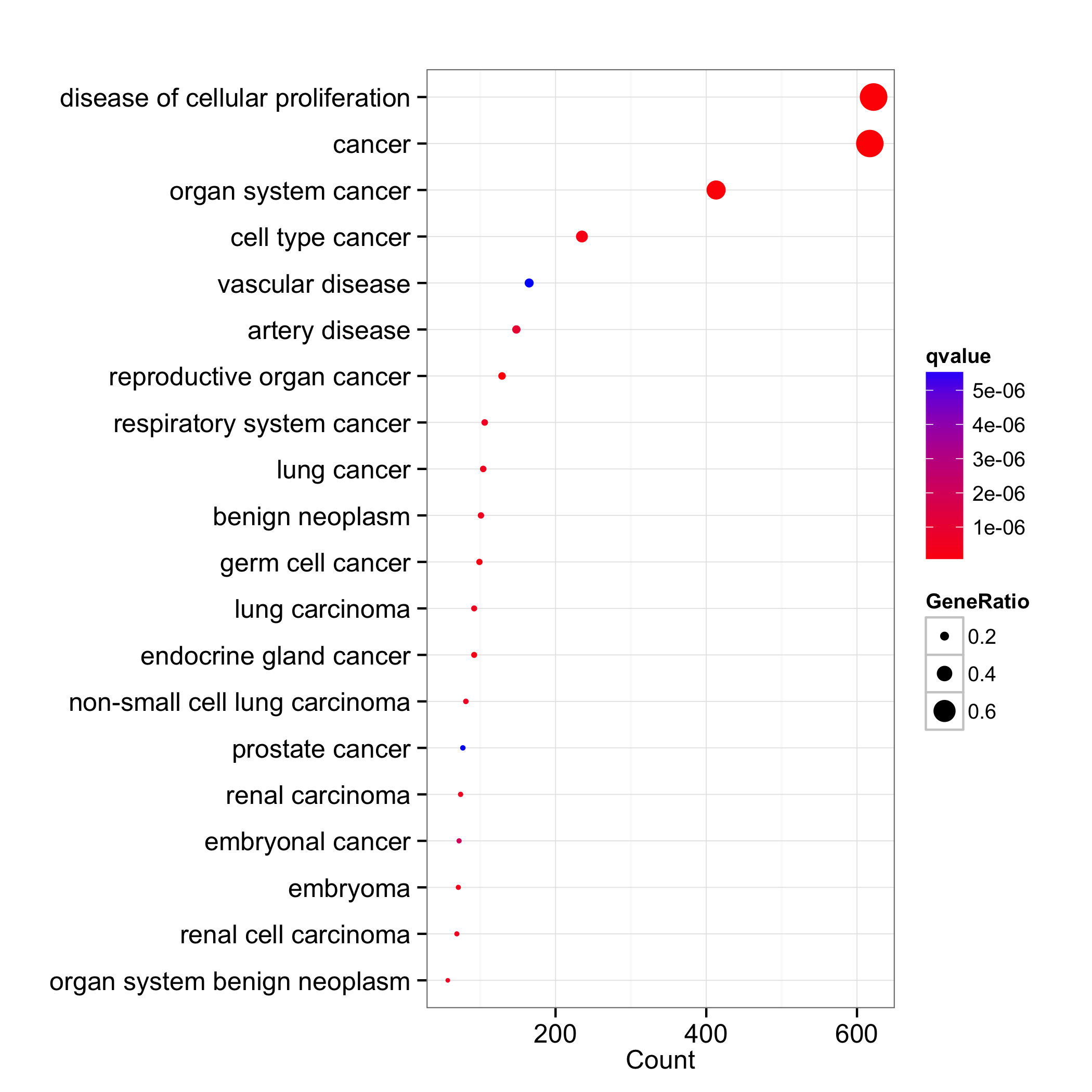
dotplot(do, x="count", showCategory=20, colorBy="qvalue")
The dotplot function is also available in clusterProfiler and ReactomePA.
Citation
Yu G, Wang L, Han Y and He Q*. clusterProfiler: an R package for comparing biological themes among gene clusters. OMICS: A Journal of Integrative Biology. 2012, 16(5):284-287.
