SIR Model of Epidemics
The SIR model divides the population to three compartments: Susceptible, Infected and Recovered. If the disease dynamic fits the SIR model, then the flow of individuals is one direction from the susceptible group to infected group and then to the recovered group. All individuals are assumed to be identical in terms of their susceptibility to infection, infectiousness if infected and mixing behaviour associated with disease transmission.
We defined: $S_t$ = the number of susceptible individuals at time t
$ I_t $ = the number of infected individuals at time t
$R_t$ = the number of recovered individuals at time t
Suppose on average every infected individual will contact $\gamma$ person, and $\kappa$ percent of these $\gamma$ person will be infected. Then on average there are $\beta = \gamma \times \kappa$ person will be infected an infected individual.
So with infected number $I_t$, they will infected $\beta I_t$ individuals. Since not all people are susceptible, this number should multiple to the percentage of susceptible individuals. Therefore, $I_t$ infected individuals will infect $\beta \frac{S_t}{N} I_t$ individuals.
Another parameter $\alpha$ describes the percentage of infected individuals to recover in a time period. That is on average, it takes $1/\alpha$ periods for an infected person to recover.
require(reshape2)
require(ggplot2)
require(gridExtra)
SIR <- function(N, S0, I0, beta, alpha, t) {
S <- numeric(t)
I <- numeric(t)
S[1] <- S0
I[1] <- I0
for (i in 2:t) {
S[i] <- S[i-1] - beta*S[i-1]/N*I[i-1]
I[i] <- I[i-1] + beta*S[i-1]/N*I[i-1] - alpha * I[i-1]
if (I[i] < 1 || S[i] < 1)
break
}
df <- data.frame(time=1:t, S=S, I=I, R=N-S-I)
df <- df[S>1&I>1,]
df$AR <- (df$I+df$R)/N
nr <- nrow(df)
rate <- df$I[2:nr]/df$I[1:(nr-1)]
df$rate <- c(rate[1], rate)
return(df)
}
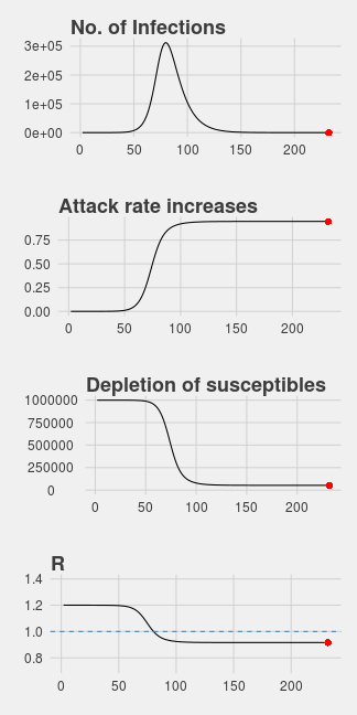
plotSIR <- function(df) {
nr <- nrow(df)
p1 <- ggplot(df, aes(time, I))+geom_line()
p1 <- p1+ggtitle("No. of Infections")
p1 <- p1+geom_point(x=df[nr, "time"], y=df[nr, "I"], color="red", size=3)
p2 <- ggplot(df, aes(time, AR))+geom_line()+xlab("")
p2 <- p2 + ggtitle("Attack rate increases")
p2 <- p2 + geom_point(x=df[nr, "time"], y=df[nr, "AR"], color="red", size=3)
p3 <- ggplot(df, aes(time, S))+geom_line()
p3 <- p3 +ggtitle("Depletion of susceptibles")
p3 <- p3+ylim(0, max(df$S)) +
geom_point(x=df[nr, "time"], y=df[nr, "S"], color="red", size=3)
p4 <- ggplot(df, aes(time, rate))+geom_line()
p4 <- p4 + ggtitle("R")+ ylim(range(df$rate)+c(-.2, .2)) +
geom_hline(yintercept=1, color="steelblue", linetype="dashed")
p4 <- p4+geom_point(x=df[nr, "time"], y=df[nr, "rate"], color="red", size=3)
grid.arrange(p1,p2,p3,p4, ncol=1)
invisible(list(p1=p1, p2=p2, p3=p3, p4=p4))
}
df <- SIR(1e6, 1e6-1, 1, 0.3, 0.1, 300)
plotSIR(df)