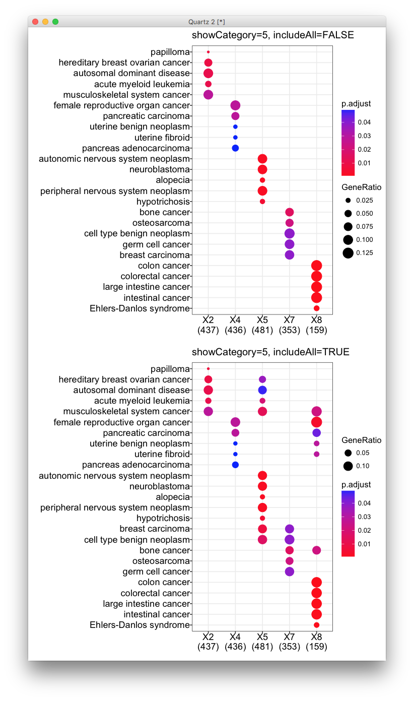
showCategory parameter for visualizing compareCluster output
I am using dotplot() to visualize results from enrichGO(), enrichDO(), enricher() and compareCluster() in clusterProfiler R package. When specifying showCategory, I get the right number of categories except with the results of compareCluser().
In my case, I use compareCluster() on a list of 3 elements:
str(ClusterList) List of 3 $ All : chr [1:1450] “89886” “29923” “100132891” “101410536” … $ g1 : chr [1:858] “89886” “29923” “100132891” “101410536” … $ g2: chr [1:592] “5325” “170691” “29953” “283392” …
CompareGO_BP=compareCluster(ClusterList, fun=“enrichGO”, pvalueCutoff=0.01, pAdjustMethod=“BH”, OrgDb=org.Hs.eg.db,ont=“BP”,readable=T)
dotplot(CompareGO_BP, showCategory=10, title=“GO - Biological Process”)
I ask for 10 categories, but I get 15 categories in All, 8 categories in g1 and 12 categories in g2. None of the categories, neither the sum of the categories are 10…
Is the option showCategory working in the case of comparison? Am I missing something here?
And which categories precisely will it plot? the most significant whatever my 3 cases or the most significant of each case?
The question was posted in Bioconductor support site. It seems quite confusing and I think I need to write a post to clarify it.
In this case, we expect to get <= 10 of most significant categories for each Cluster as the user specify showCategory=10. This is exactly the way of dotplot and barplot methods do for compareClusterResult. 8 categories for g1 is obvious that there are only 8 enriched terms found for g1.
But why there are 15 for All and 12 for g2?
dotplot and barplot methods implemented in clusterProfiler try to make the comparison among clusters more informative and reasonable. After extracting e.g. 10 categories for each cluster, clusterProfiler try to collect overlap of these categories among clusters.
For example, term A is enriched in all the clusters (All, g1 and g2) and is in the 10 most significant categories for g1 but not All and g2. clusterProfiler try to capture these information and include term A in All and g2 clusters and making the comparison in dotplot/barplot more reasonable.
If users want to ignore these information, they can use dotplot(..., includeAll=FALSE), which is actually not recommended.
See the difference to the following example:
library(clusterProfiler)
data(gcSample)
x=compareCluster(gcSample, fun='enrichDO')
dotplot(x, showCategory=5, includeAll=FALSE)
dotplot(x, showCategory=5)

In the first figure, it seems that all these clusters are very different, with no overlapping terms enriched. This is not true as demonstrated in the second figure.
Citation
Yu G, Wang L, Han Y and He Q*. clusterProfiler: an R package for comparing biological themes among gene clusters. OMICS: A Journal of Integrative Biology. 2012, 16(5):284-287.