
dotplot for GSEA result
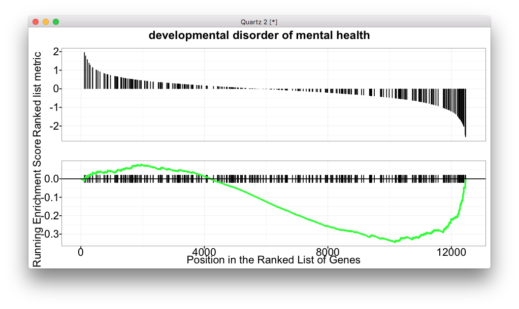
For GSEA analysis, we are familar with the above figure which shows the running enrichment score. But for most of the software, it lack of visualization method to summarize the whole enrichment result.
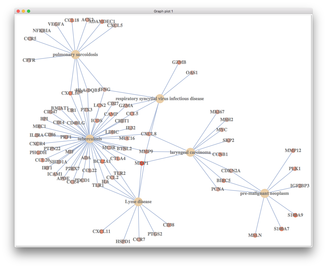
In DOSE (and related tools including clusterProfiler, ReactomePA and meshes), we provide enrichMap and cnetplot to summarize GSEA result.

Here is an example of using enrichMap which is good to visualize relationship among enriched gene sets.
cnetplot excel on visualizing relationship among gene sets and corresponding core genes.
Now DOSE support visualize GSEA result using dotplot which can visualize more enriched gene sets in one figure. This is a feature request from @guidohooiveld.
dotplot was previously implemented in DOSE to visualize hypergeometric test result. I modified it to support GSEA result.
Internally, .sign was reserved for the sign of NES (activated for NES > 0 and suppressed for NES < 0). We can pass split parameter and then it will apply showCategory by splitting the results. The following example plot 30 activated and 30 suppressed enriched disease sets.

PS: Count is the number of core genes and GeneRatio is Count/setSize.
Citation
G Yu, LG Wang, GR Yan, QY He. DOSE: an R/Bioconductor package for Disease Ontology Semantic and Enrichment analysis. Bioinformatics 2015, 31(4):608-609.
