
scatterpie for plotting pies on ggplot
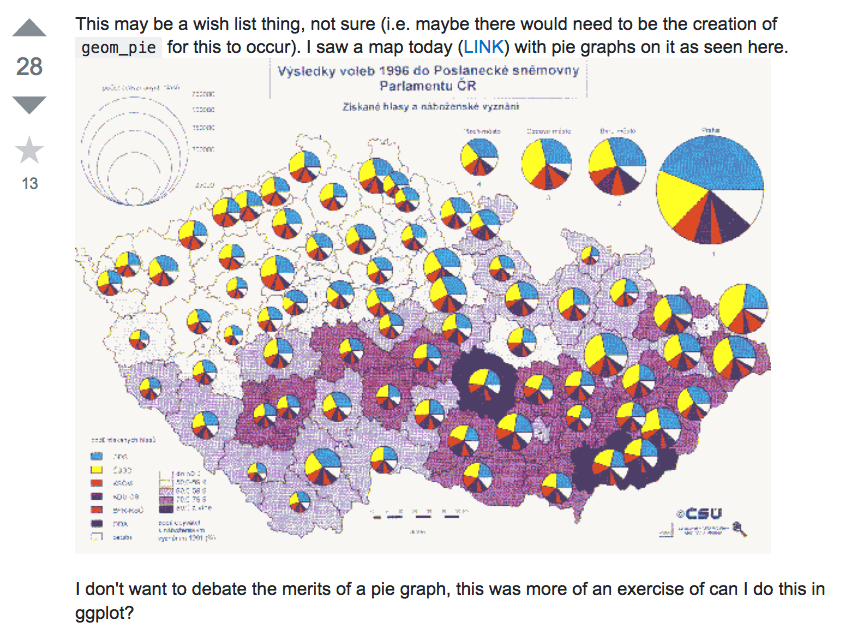
Plotting pies on ggplot/ggmap is not an easy task, as ggplot2 doesn’t provide native pie geom. The pie we produced in ggplot2 is actually a barplot transform to polar coordination. This make it difficult if we want to produce a map like the above screenshot, which was posted by Tyler Rinker, the author of R package pacman.
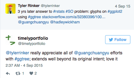
The question remained unsolved until he discovered that ggtree can do it. The ggtree solution is to use the subview function, which is good for embeding subplots and can embed different types of plots and even user’s own image files.
But it has its own drawbacks for plotting pies on map. First, it render plots as raster image make it slow to render when we plotting a lot of pies. Second we need some hacks to add legend.
Thanks to the ggforce package, which provides a native implementation of the pie geom, we can plot pies on cartesian coordination.
I created a wrapper function to make it more easy to plot a set of pies.
For example, suppose we have the following data:
set.seed(123)
long <- rnorm(50, sd=100)
lat <- rnorm(50, sd=50)
d <- data.frame(long=long, lat=lat)
d <- with(d, d[abs(long) < 150 & abs(lat) < 70,])
n <- nrow(d)
d$region <- factor(1:n)
d$A <- abs(rnorm(n, sd=1))
d$B <- abs(rnorm(n, sd=2))
d$C <- abs(rnorm(n, sd=3))
d$D <- abs(rnorm(n, sd=4))
d$radius <- 6 * abs(rnorm(n))
head(d)

##          long        lat region          A        B        C        D
## 1  -56.047565  12.665926      1 0.71040656 2.887786 1.309570 2.892264
## 2  -23.017749  -1.427338      2 0.25688371 1.403569 1.375096 4.945092
## 4    7.050839  68.430114      3 0.24669188 0.524395 3.189978 5.138863
## 5   12.928774 -11.288549      4 0.34754260 3.144288 3.789556 2.295894
## 8 -126.506123  29.230687      5 0.95161857 3.029335 1.048951 2.471943
## 9  -68.685285   6.192712      6 0.04502772 3.203072 2.596539 4.439393
##      radius
## 1 6.4847970
## 2 3.7845247
## 4 0.6818394
## 5 9.1974120
## 8 3.1267039
## 9 2.9392227
It is very easy to draw the pies on the map by the geom_scatterpie layer.
library(ggplot2)
library(scatterpie)

world <- map_data('world')
p <- ggplot(world, aes(long, lat)) +
    geom_map(map=world, aes(map_id=region), fill=NA, color="black") +
    coord_quickmap()
p + geom_scatterpie(aes(x=long, y=lat, group=region, r=radius),
                    data=d, cols=LETTERS[1:4], color=NA, alpha=.8) +
    geom_scatterpie_legend(d$radius, x=-160, y=-55)
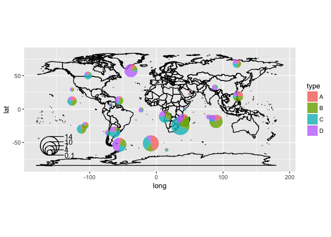
This is just a simple application of the ggforce, and I find many people like it. They even asked me to implement the pie size legend. I do implemented a geom_scatterpie_legend layer and as the name indicated, it add a legend of the pie sizes as demonstrated in the above figure.
The source code is quite simple, and it is impossible without ggforce. Now this package is availabel on CRAN, you can use install.packages('scatterpie') to install it and visit the online vignette.
