还想用clusterProfiler以前的那些画图函数,怎么办?

I have been using clusterProfiler, which is a very useful package for gene set analysis and visualisation. I would like to use the ‘cnetplot’ function to plot a network of GO terms and the related genes. However for larger networks, the automatic display can be confusing and it would be helpful to be able to move nodes around. In the past I could do this with with cnetplot(fixed=FALSE) option, but after updating R and re-installing clusterProfiler, the output remains static.
I am using R 3.5.3 with clusterProfiler v3.10.1 which I installed using Bioconductor 3.8. I have installed and loaded the ‘igraph’ package, and the following test code produces output in an interactive window, as desired:
library(igraph) g <- make_ring(10) tkplot(g)
Is there any way to make cnetplot output interactive, or is that functionality simply not available in the latest release?
Any help would be greatly appreciated!
这个需求应该还是不少人关注的,在知识星球上也有人问到。
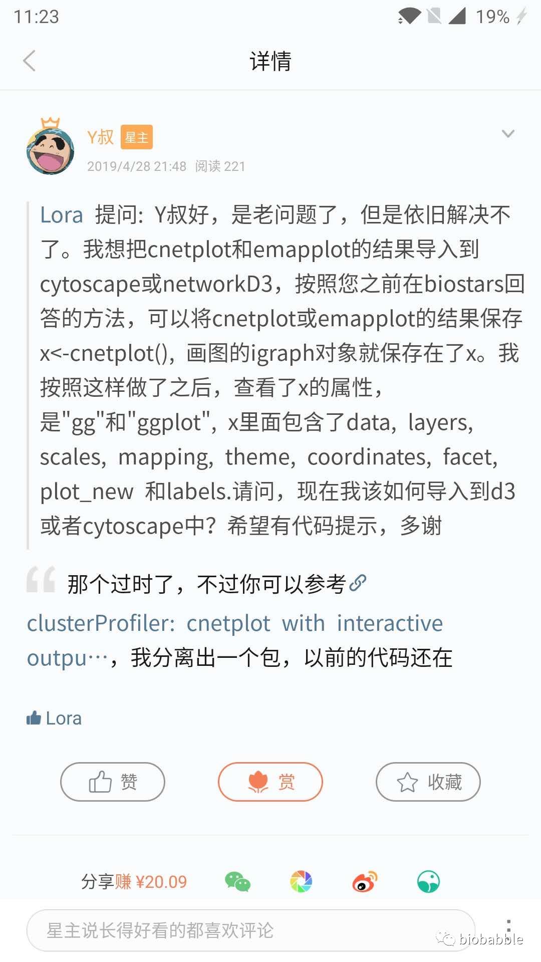
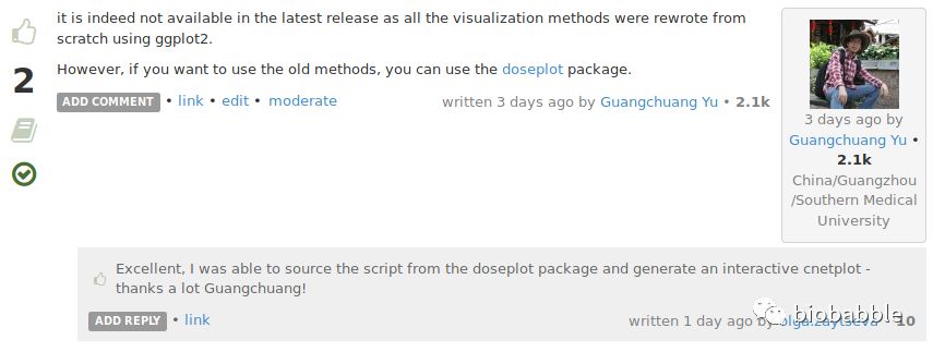
我把可视化方法重新用ggplot2实现了,原来的函数就被我扔了,新的可视化方法,固然是有更好的优势,但原来的函数画出来的网络图是可以拖拽的,这是优势之一,所以你看到以前的函数画的图布局比较好看的情况,多半就是先点鼠标试不同的layout,然后手工拖拽微调;再者函数返回的是igraph对象,你可以对其进一步操作,或者导出到cytoscape中,这是优势之二。

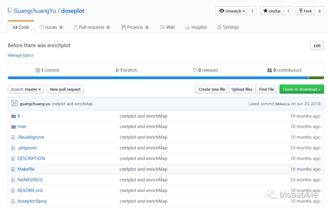
当然还有一点,就是你想重复出以前版本的图,这种情况似乎你只能安装一个老版本的R和老版本的DOSE, clusterProfiler包,不过做为一个细心细致的人,我早就想到了,在重新实现了新的画图函数的时候,就已经把老函数分离出来,打一个R包,以备大家所需。
https://github.com/GuangchuangYu/doseplot