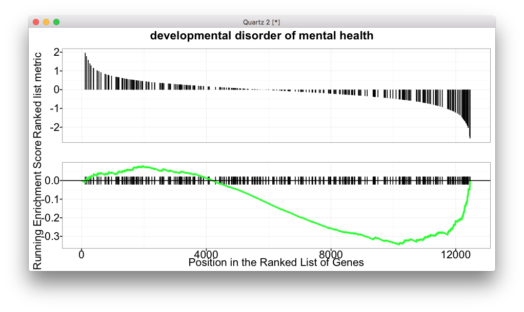
虽然我不喜欢DAVID,但很多用户喜欢,所以clusterProfiler也支持了,最近github上又有人要求支持自定义背景。
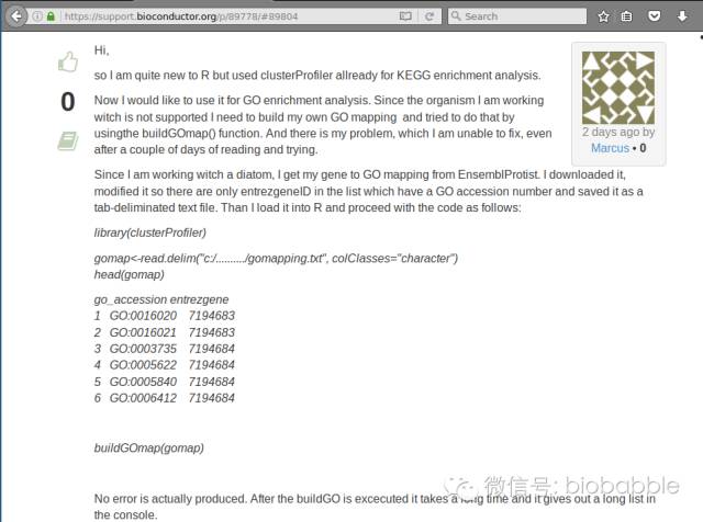
Dear Guangchuang,
I am using clusterProfiler in Kegg pathway enrichment analysis, it is useful and nice. I am looking for a function which accept background and has ability to deal with Ensembl gene ID.
In a function enrichDAVID it can takes ensembl gene id as an input format, but not allows to enter background.
enrichDAVID(gene = gene, idType="ENSEMBL_GENE_ID", annotation="KEGG_PATHWAY", species= "hsa")Other command enrichKEGG has a background input but only takes entrez gene id,
enrichKEGG(gene, organism = "hsa", keyType = "kegg", universe)I have tried to convert my ensembl gene IDs to entrez gene id, but some ensembl gene IDs represent more than one entrez gene ID. I downloaded KEGG pathway dataset to apply fisher exact test. however, genes are in entrez ID and i am still dont know how to convert.