visualizing reassortment history using seqcombo
Reassortment is an important strategy for influenza A viruses to introduce a HA subtype that is new to human populations, which creates the possibilities of pandemic.

A diagram showed above (Figure 2 of doi:10.1038/srep25549) is widely
used to illustrate the reassortment events. While such diagrams are
mostly manually draw and edit without software tool to automatically
generate. Here, I implemented the hybrid_plot function for producing
publication quality figure of reassortment events.
library(tibble)
library(ggplot2)


n <- 8

virus_info <- tibble(
    id = 1:7,
    x = c(rep(1990, 4), rep(2000, 2), 2009),
    y = c(1,2,3,5, 1.5, 3, 4),
    segment_color = list(
        rep('purple', n),
        rep('red', n),
        rep('darkgreen', n),
        rep('lightgreen', n),
        c('darkgreen', 'darkgreen', 'red', 'darkgreen', 'red', 'purple', 'red', 'purple'),
        c('darkgreen', 'darkgreen', 'red', 'darkgreen', 'darkgreen', 'purple', 'red', 'purple'),
        c('darkgreen', 'lightgreen', 'lightgreen', 'darkgreen', 'darkgreen', 'purple', 'red', 'purple'))
)

flow_info <- tibble(from = c(1,2,3,3,4,5,6),
                    to = c(5,5,5,6,7,6,7))
hybrid_plot(virus_info, flow_info)
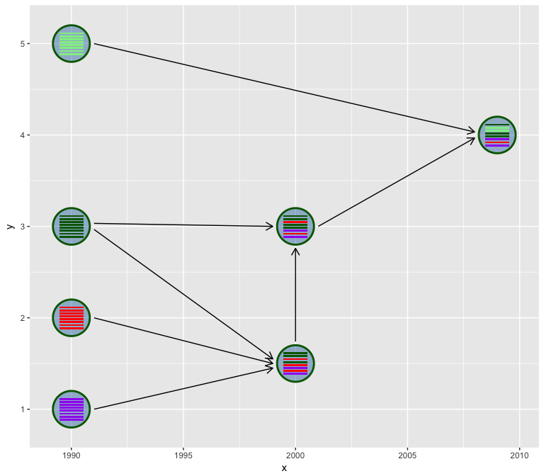
The hybrid_plot requires two tibble data frame of virus information
and genetic flow information.
Users need to provide x and y positions to plot the virus, this make
sense for geographically and temporally information are usually
available in such phylodynamic study and can be employed to set x or
y to provide more information and help interpretation of the
reassortment events.
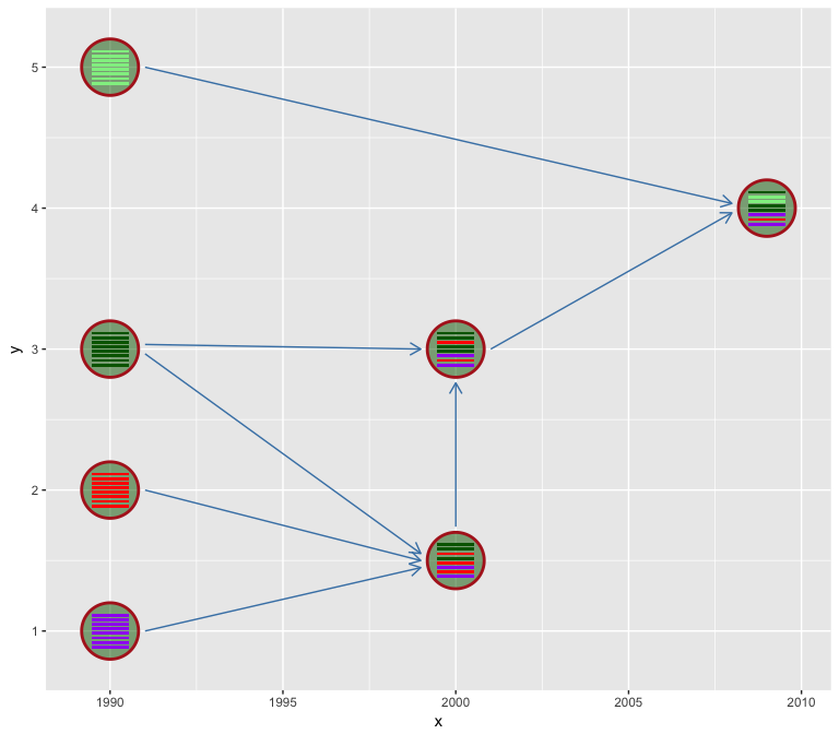
We use hexagon to represent virus. Users can set the virus outer
boundary color by v_color and fill the virus by v_fill. Color of
line segments that indicate the genetic flow relationship can be specify
via l_color parameter.
hybrid_plot(virus_info, flow_info, v_color='firebrick', v_fill='darkgreen', l_color='steelblue')
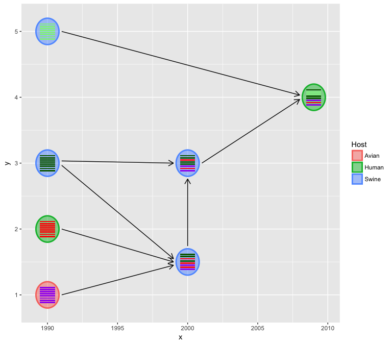
We usually have more information to present, for example host
information and HA subtype etc. and these information can be used to
color the virus either by v_color or v_fill
virus_info$Host = c("Avian", "Human", rep("Swine", 4), "Human")
hybrid_plot(virus_info, flow_info, v_color=~Host, v_fill=~Host)
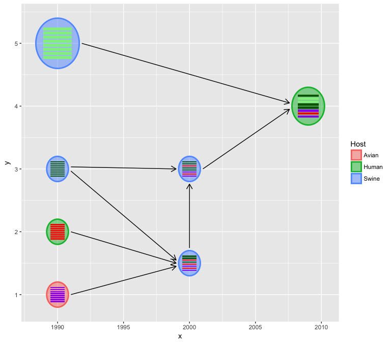
The relative virus size can also be specify if a virus_size column is
available in the input virus_info data.
virus_info$virus_size <- c(rep(1, 3), 2, 1, 1, 1.5)
hybrid_plot(virus_info, flow_info, v_color=~Host, v_fill=~Host)
If label and label_position coloumns are available, the virus labels
(virus name or other information) will be added automatically.
virus_info$label <- c("Avian", "Human\nH3N2", "Classic\nswine\nH1N1", "Eurasian swine",
                      "North American swine\n triple reassrotant H3N2",
                      "North American swine\n triple reassortant H1N2", "2009 Human H1N1")
virus_info$label_position <- c('left', 'left', 'left', 'below', 'below', 'upper', 'below')
hybrid_plot(virus_info, flow_info, v_color=~Host, v_fill=~Host)
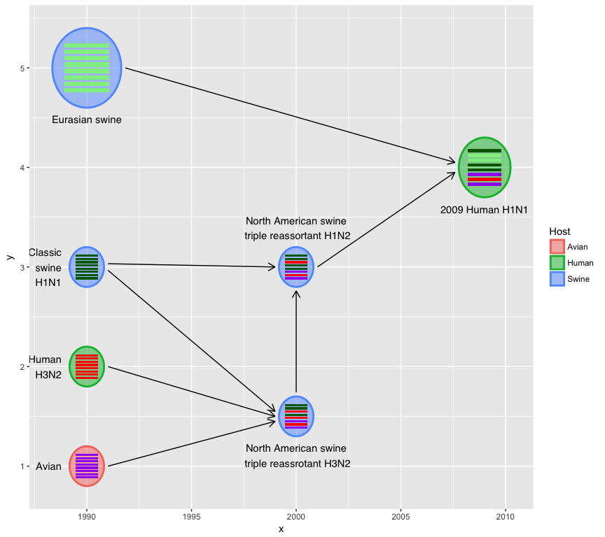
User can use asp to set the aspect ratio of hexagons, asp < 1 for
thick/short and asp > 1 for thin/tall.
hybrid_plot(virus_info, flow_info, v_color=~Host, v_fill=~Host, asp=2)
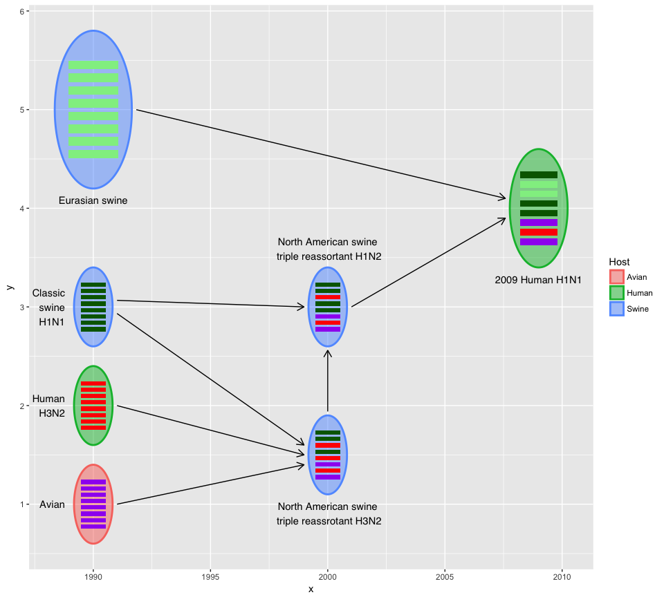
The output of hybrid_plot is a ggplot object and users can use
ggplot2 to modify the details.
title <- "Reassortment events in evolution of the 2009 influenza A (H1N1) virus"
caption <- 'Gene segments: PB2, PB1, PA, HA, NP, NA, M, NS'
color <- c(Avian="purple", Human="red", Swine="darkgreen")

hybrid_plot(virus_info, flow_info, v_color=~Host, v_fill=~Host) +
    labs(caption=caption, title=title) +
    scale_color_manual(values=color) + scale_fill_manual(values=color) +
    scale_x_continuous(breaks=c(1990, 2000, 2009)) +
    xlab(NULL) + ylab(NULL) + theme_minimal() +
    theme(axis.line.y = element_blank(),
          axis.text.y = element_blank(),
          axis.ticks.y = element_blank(),
          panel.grid.minor=element_blank(),
          panel.grid.major.y=element_blank(),
          legend.position = c(.95, .1)
          )
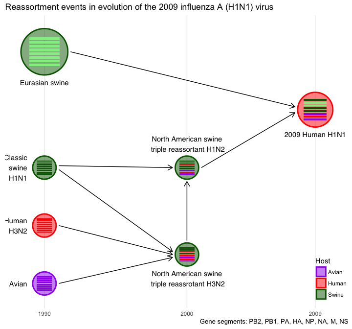
Top-down or bottom-up style is also supported.
x <- virus_info$x
virus_info$x <- virus_info$y
virus_info$y <- x
virus_info$label_position <- c(rep("right", 3), "left", "left", "right", "right")
hybrid_plot(virus_info, flow_info, v_color=~Host, v_fill=~Host) +
    scale_y_reverse() + scale_x_continuous(limits=c(0, 5.5))
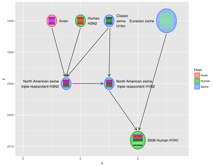
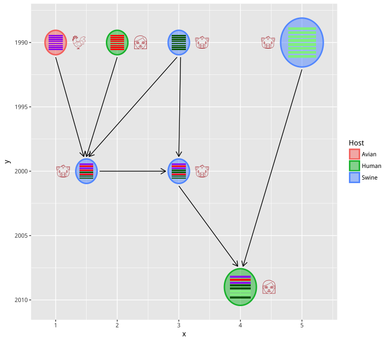
User can also use Emoji to label the virus (host information in this example):
virus_info$label <- c("chicken", "woman", "pig", "pig", "pig", "pig", "woman")
hybrid_plot(virus_info, flow_info, v_color=~Host, v_fill=~Host,
              parse='emoji', t_size=8, t_color='firebrick') +
    scale_y_reverse()
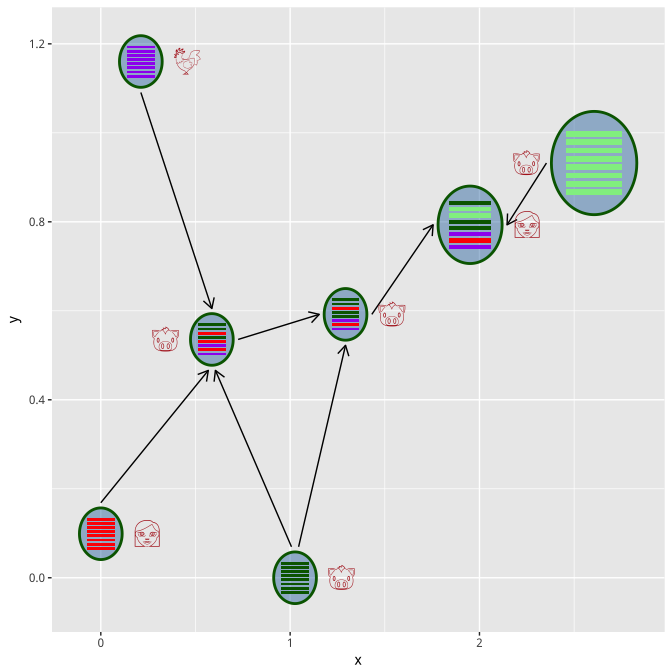
In case you don’t have xy-coordination information, you can use
set_layout function to auto setting the xy position using selected
layout function.
virus_info <- set_layout(virus_info, flow_info, layout="layout.kamada.kawai")
hybrid_plot(virus_info, flow_info, parse='emoji', t_size=8, t_color='firebrick')
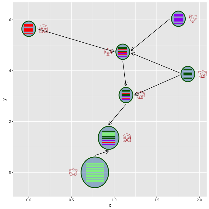
virus_info <- set_layout(virus_info, flow_info, layout="layout.fruchterman.reingold")
hybrid_plot(virus_info, flow_info, parse='emoji', t_size=8, t_color='firebrick')
Please let me know if you know any published reassortment data that contain spatial information, I will demonstrate how to visualize reassortment history on a map.