I have splitted ggtree to 2 packages, treeio and ggtree. Now ggtree is mainly focus on visualization and annotation, while treeio focus on parsing and exporting tree files. Here is a welcome message from treeio that you can convert ggtree output to tree object which can be exported as newick or nexus file if you want.

Thanks to ggplot2, output of ggtree is actually a ggplot object. The ggtree object can be rendered as graph by print method, but internally it is an object that contains data. treeio defines as.phylo and as.treedata to convert ggtree object to phylo or treedata object.
Continue reading

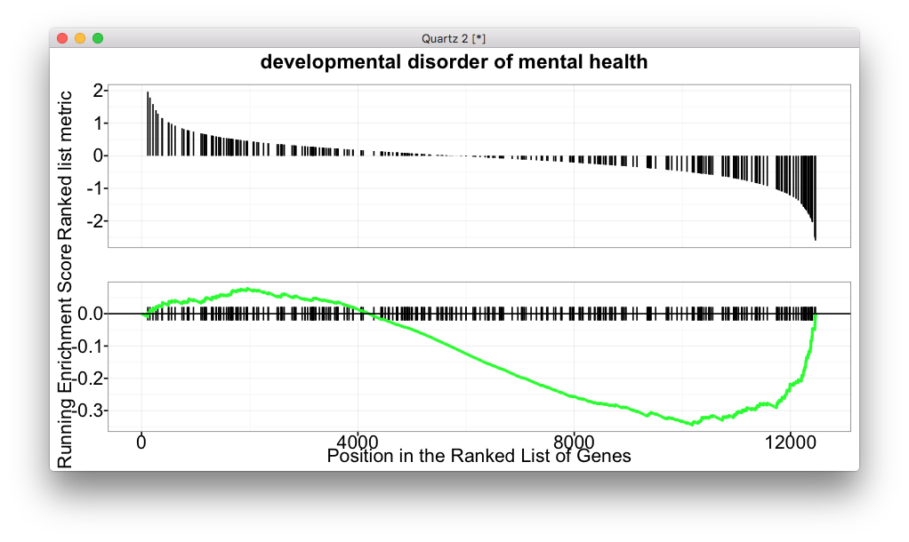
dotplot for GSEA result

For GSEA analysis, we are familar with the above figure which shows the running enrichment score. But for most of the software, it lack of visualization method to summarize the whole enrichment result.

In DOSE (and related tools including clusterProfiler, ReactomePA and meshes), we provide enrichMap and cnetplot to summarize GSEA result.

Continue reading

This is a question from ggtree google group:

Dear ggtree team,

how can I apply a geom_xxx to only one facet panel? For example if i want to get geom_hline(yintersect=1:30) or a geom_text() in the dot panel? I cant see the facet_grid(. ~ var) function call, so I don’t know which subsetting to use. I have already read http://stackoverflow.com/questions/29873155/geom-text-and-facets-not-working

  tr <- rtree(30)
  
  d1 <- data.frame(id=tr$tip.label, val=rnorm(30, sd=3))
  p <- ggtree(tr)
  
  p2 <- facet_plot(p, panel="dot", data=d1, geom=geom_point, aes(x=val), color='firebrick')
  d2 <- data.frame(id=tr$tip.label, value = abs(rnorm(30, mean=100, sd=50)))
  
  p3 <- facet_plot(p2, panel='bar', data=d2, geom=geom_segment, aes(x=0, xend=value, y=y, yend=y), size=3, color='steelblue') + theme_tree2()

Thanks! Andreas

If this can be done, we can create even more comprehensive tree plots.

Continue reading

Edge coloring with user data

Coloring edges in ggtree is quite easy, as we can map the color to numerical or categorical values via the aes(color=VAR) syntax. For user’s own data, it is also easy as ggtree provide the %<+% operator to attach user data.

But as it seems not so obviously for ggtree users, see question 1, 2, and 3, I will demonstrate how to color edges using user data here.

Continue reading

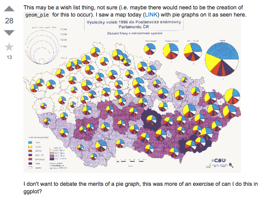
Plotting pies on ggplot/ggmap is not an easy task, as ggplot2 doesn’t provide native pie geom. The pie we produced in ggplot2 is actually a barplot transform to polar coordination. This make it difficult if we want to produce a map like the above screenshot, which was posted by Tyler Rinker, the author of R package pacman.

Continue reading

Author's picture

Guangchuang Yu

Bioinformatics Professor @ SMU

Bioinformatics Professor

Guangzhou