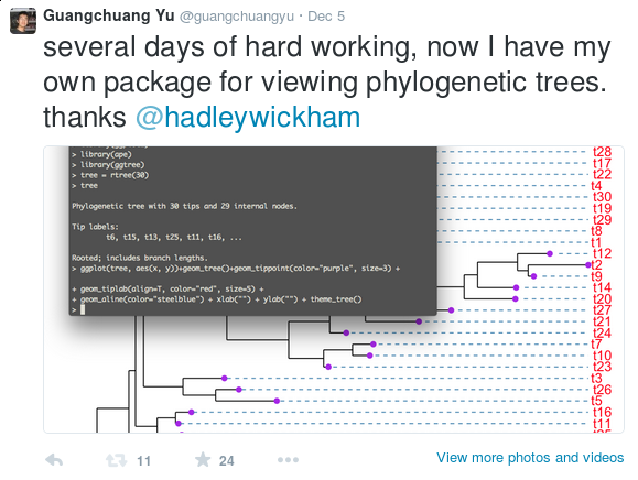
When I need to annotate nucleotide substitutions in the phylogenetic tree, I found that all the software are designed to display the tree but not annotating it. Some of them may support annotating the tree with specific data such as bootstrap values, but they are restricted to a few supported data types. It is hard/impossible to inject user specific data.
The SIR model divides the population to three compartments: Susceptible, Infected and Recovered. If the disease dynamic fits the SIR model, then the flow of individuals is one direction from the susceptible group to infected group and then to the recovered group. All individuals are assumed to be identical in terms of their susceptibility to infection, infectiousness if infected and mixing behaviour associated with disease transmission.
We defined: $S_t$ = the number of susceptible individuals at time t
$ I_t $ = the number of infected individuals at time t
$R_t$ = the number of recovered individuals at time t
Suppose on average every infected individual will contact $\gamma$ person, and $\kappa$ percent of these $\gamma$ person will be infected. Then on average there are $\beta = \gamma \times \kappa$ person will be infected an infected individual.
Nearest gene annotation
Almost all annotation software calculate the distance of a peak to the nearest TSS and assign the peak to that gene. This can be misleading, as binding sites might be located between two start sites of different genes or hit different genes which have the same TSS location in the genome.
The function annotatePeak provides option to assign genes with a max distance cutoff and all genes within this distance were reported for each peak.
Why use ggplot2
ggplot2是我见过最human friendly的画图软件,这得益于Leland Wilkinson在他的著作《The Grammar of Graphics》中提出了一套图形语法,把图形元素抽象成可以自由组合的成分,Hadley Wickham把这套想法在R中实现。
为什么要学习ggplot2,可以参考ggplot2: 数据分析与图形艺术的序言(btw: 在序言的最后,我被致谢了)。
Hadley Wickham也给出一堆理由让我们说服自己,我想再补充一点,Hadley Wickham是学医出身的,做为学生物出身的人有什么理由不支持呢:)
After two weeks developed, I have added/updated some plot functions in ChIPseeker (version >=1.0.1).
ChIP peaks over Chromosomes
> files=getSampleFiles()
> peak=readPeakFile(files[[4]])
> peak
GRanges object with 1331 ranges and 2 metadata columns:
seqnames ranges strand | V4 V5
|
[1] chr1 [ 815092, 817883] * | MACS_peak_1 295.76
[2] chr1 [1243287, 1244338] * | MACS_peak_2 63.19
[3] chr1 [2979976, 2981228] * | MACS_peak_3 100.16
[4] chr1 [3566181, 3567876] * | MACS_peak_4 558.89
[5] chr1 [3816545, 3818111] * | MACS_peak_5 57.57
... ... ... ... ... ... ...
[1327] chrX [135244782, 135245821] * | MACS_peak_1327 55.54
[1328] chrX [139171963, 139173506] * | MACS_peak_1328 270.19
[1329] chrX [139583953, 139586126] * | MACS_peak_1329 918.73
[1330] chrX [139592001, 139593238] * | MACS_peak_1330 210.88
[1331] chrY [ 13845133, 13845777] * | MACS_peak_1331 58.39
---
seqlengths:
chr1 chr10 chr11 chr12 chr13 chr14 ... chr6 chr7 chr8 chr9 chrX chrY
NA NA NA NA NA NA ... NA NA NA NA NA NA
> covplot(peak, weightCol="V5")
生物坑很多人画图只会直方图,统计只会T检验,在暨大见过太多的学生连T检验都不会,分不清SEM和SD的差别,也不清楚T检验那几个简单参数的含义。我写统计笔记也是因为不想重复性地跟学生讲解T检验。
Barplot和T test一样普遍而流行,barplot适合于表示计数数据和比例,显示比例也可以用pie plot,但直方图比饼图要好,因为人类的眼睛适合于比较高度,而不是弧度。
多半时候生物学数据并非简单的计数数据,对于测量数据,在展示数据分布时,很多人会使用他们熟悉的barplot,用高度来表示mean,然后再加上errorbar,这样展示数据,信息量是非常低的,使用boxplot能够提供更多的数据分布信息,能更好地展现数据,但可能很多人只会在excel里画barplot,Nature Methods 2013年的文章中有100个barplot图,而只有20个boxplot图,从这里就可以看出来,用boxplot的人远远没有barplot多,于是NPG怒了,写了两篇专栏文章Points of View: Bar charts and box plots和Points of Significance: Visualizing samples with box plots并且发表了一篇BoxPlotR: a web tool for generation of box plots方便大家画boxplot,如此简单的web tool能够发Nature Methods,实在是让人羡慕妒忌恨啊。