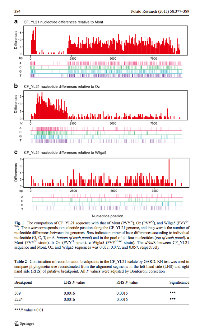
这是高老师文章里的图,每一个小图都是通过比较两条比对序列差异而做出来的,从图A和B中可以看出,CF_YL21有可能是Mont和Oz两条序列重组而来。高老师自己做出这图后,深知手工统计序列差异、画图、拼图之困难。问我有没有办法读两条序列,生成一个图。

这是高老师文章里的图,每一个小图都是通过比较两条比对序列差异而做出来的,从图A和B中可以看出,CF_YL21有可能是Mont和Oz两条序列重组而来。高老师自己做出这图后,深知手工统计序列差异、画图、拼图之困难。问我有没有办法读两条序列,生成一个图。
通常做blast,我都是输出asn格式,然后用blast_formatter抽出需要的信息写成表格格式。
序列的description行当然不会有重复,但是ID (第一个空白前面的字符)是有重复的,从qseqid来看,就分不清是那个序列,于是准备让blast_formatter把query title(整个description line)给输出来,结果仔细阅读了blastn -help发现不支持呀不支持!然而它支持stitle和salltitle,也就是subject的可以,但query的不行,这绝逼是一个大坑!_| ̄|○
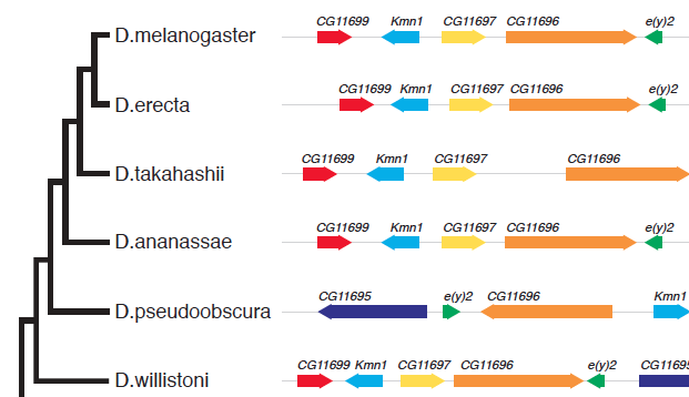
A question on biostars asking how to generate the following figure:

This can be quite easy to implement in ggtree, I can write a geom layer to layout the alignment. As ggbio already provides many geom for genomic data and I don’t want to re-invent the wheel, I decided to try ggtree+ggbio. This is also the beauty of R that packages complete each others.
这是最近github上的问题,如何反转time scale,也就是把最近的时间设为0。而内部节点为距今多少年,这个很容易,把x轴的值变成x-max(x)就可以,感觉这个也只会在时间树上使用,所以取名revts(reverse time scale),revts之后,x轴最大值是0,其它为负数,可以使用scale_x_continuous改label为绝对值。
I am using dotplot() to visualize results from enrichGO(), enrichDO(), enricher() and compareCluster() in clusterProfiler R package. When specifying showCategory, I get the right number of categories except with the results of compareCluser().
In my case, I use compareCluster() on a list of 3 elements:
str(ClusterList) List of 3 $ All : chr [1:1450] “89886” “29923” “100132891” “101410536” … $ g1 : chr [1:858] “89886” “29923” “100132891” “101410536” … $ g2: chr [1:592] “5325” “170691” “29953” “283392” …
CompareGO_BP=compareCluster(ClusterList, fun=“enrichGO”, pvalueCutoff=0.01, pAdjustMethod=“BH”, OrgDb=org.Hs.eg.db,ont=“BP”,readable=T)
dotplot(CompareGO_BP, showCategory=10, title=“GO - Biological Process”)
I ask for 10 categories, but I get 15 categories in All, 8 categories in g1 and 12 categories in g2. None of the categories, neither the sum of the categories are 10…
Is the option showCategory working in the case of comparison? Am I missing something here?
And which categories precisely will it plot? the most significant whatever my 3 cases or the most significant of each case?
The question was posted in Bioconductor support site. It seems quite confusing and I think I need to write a post to clarify it.
A ggtree user recently asked me the following question in google group:
I try to plot long tip labels in ggtree and usually adjust them using xlim(), however when creating a facet_plot xlim affects all plots and minimizes them.
Is it possible to work around this and only affect the tree and it’s tip labels leaving the other plots in facet_plot unaffected?
This is indeed a desire feature, as ggplot2 can’t automatically adjust xlim for text since the units are in two different spaces (data and pixel).
ggtree provides gheatmap for visualizing heatmap and msaplot for visualizing multiple sequence alignment with phylogenetic tree.
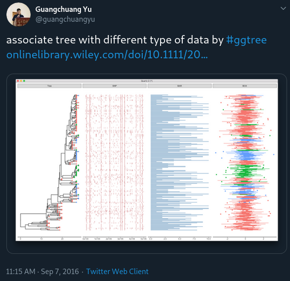
We may have different data types and want to visualize and align them with the tree. For example, dotplot of SNP site (e.g. using geom_point(shape='|')), barplot of trait values (e.g. using geom_barh(stat='identity')) et al.
To make it easy to associate different types of data with phylogenetic tree, I implemented the facet_plot function which accepts a geom function to draw the input data.frame and display it in an additional panel.
