use emoji font in R

![](http://guangchuangyu.github.io/blog_images/2015/Screenshot 2015-12-16 10.55.49.png)

I have played with emoji in R for a while. My solution of using it is different from what implemented in emoGG.

emoGG is a good attemp to add emoji in ggplot2. It render emoji picture (png) and creat a layer, geom_emoji, to add emoji.

In my opinion, emoji should be treated as ordinary font in user interface, albeit it maynot be true internally.

It would be more flexible if we can use emoji as ordinary font and in this way user don’t need to learn extra stuff.
Continue reading

To simplify enriched GO result, we can use slim version of GO and use enricher function to analyze.

Another strategy is to use GOSemSim to calculate similarity of GO terms and remove those highly similar terms by keeping one representative term. To make this feature available to clusterProfiler users, I develop a simplify method to reduce redundant GO terms from output of enrichGO function.

require(clusterProfiler)
data(geneList, package="DOSE")
de <- names(geneList)[abs(geneList) > 2]
bp <- enrichGO(de, ont="BP")
enrichMap(bp)

Continue reading

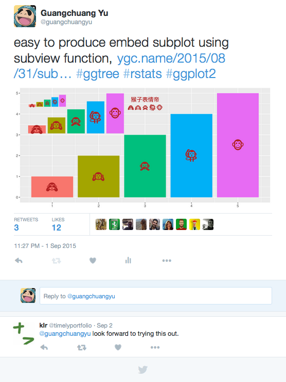
subview

I implemented a function, subview, in ggtree that make it easy to embed a subplot in ggplot.

An example is shown below:

library(ggplot2)
library(ggtree)

dd <- data.frame(x=LETTERS[1:3], y=1:3)
pie <- ggplot(dd, aes(x=1, y, fill=x)) + 
	geom_bar(stat="identity", width=1) + 
	coord_polar(theta="y") + theme_tree() + 
	xlab(NULL) + ylab(NULL) + 
	theme_transparent()

x <- sample(2:9)
y <- sample(2:9)
width <- sample(seq(0.05, 0.15, length.out=length(x)))
height <- width

p <- ggplot(data=data.frame(x=c(0, 10), y=c(0, 10)), aes(x, y))+geom_blank()
print(p)
for (i in seq_along(x)) {
	p %<>% subview(pie, x[i], y[i], width[i], height[i])
	print(p)
}

Continue reading

This is a feature request from clusterProfiler user. It’s similar to what I implemented in clusterProfiler for comparing biological themes. For comparing different enrichment results, the x-axis represent different gene clusters while for a single enrichment result, the x-axis can be gene count or gene ratio. This is actually similar to traditional barplot, with dot position as bar height and dot color as bar color. But dotplot can represent one more feature nicely by dot size and it can be a good alternative to barplot.

Continue reading

Author's picture

Guangchuang Yu

Bioinformatics Professor @ SMU

Bioinformatics Professor

Guangzhou